Front-end developers
See every breakpoint without leaving the code.
Keep Viewport open on localhost while you build. Scroll one screen and watch 375, 768 and 1280 move together, then fix what breaks while it’s still on screen.
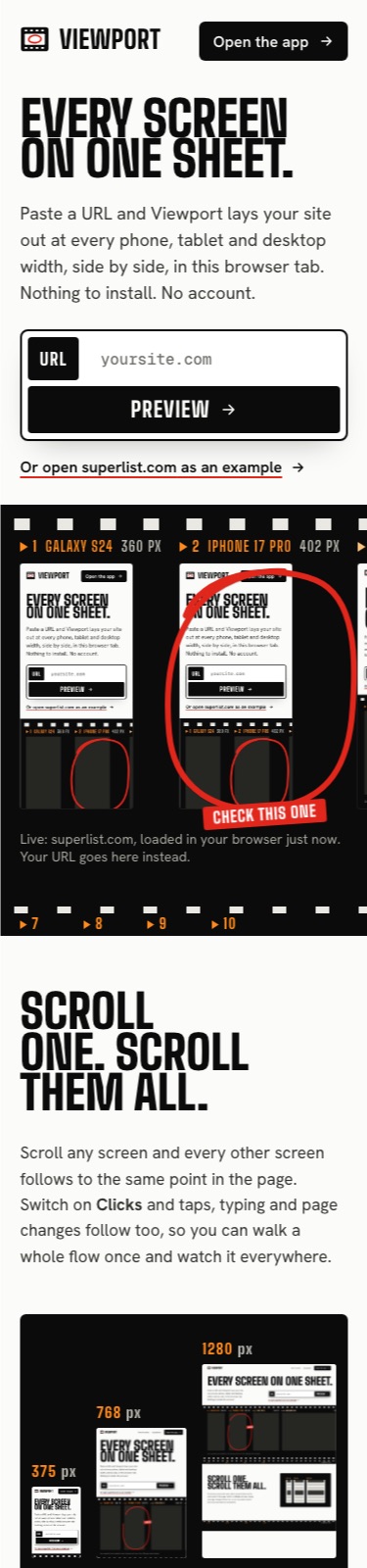
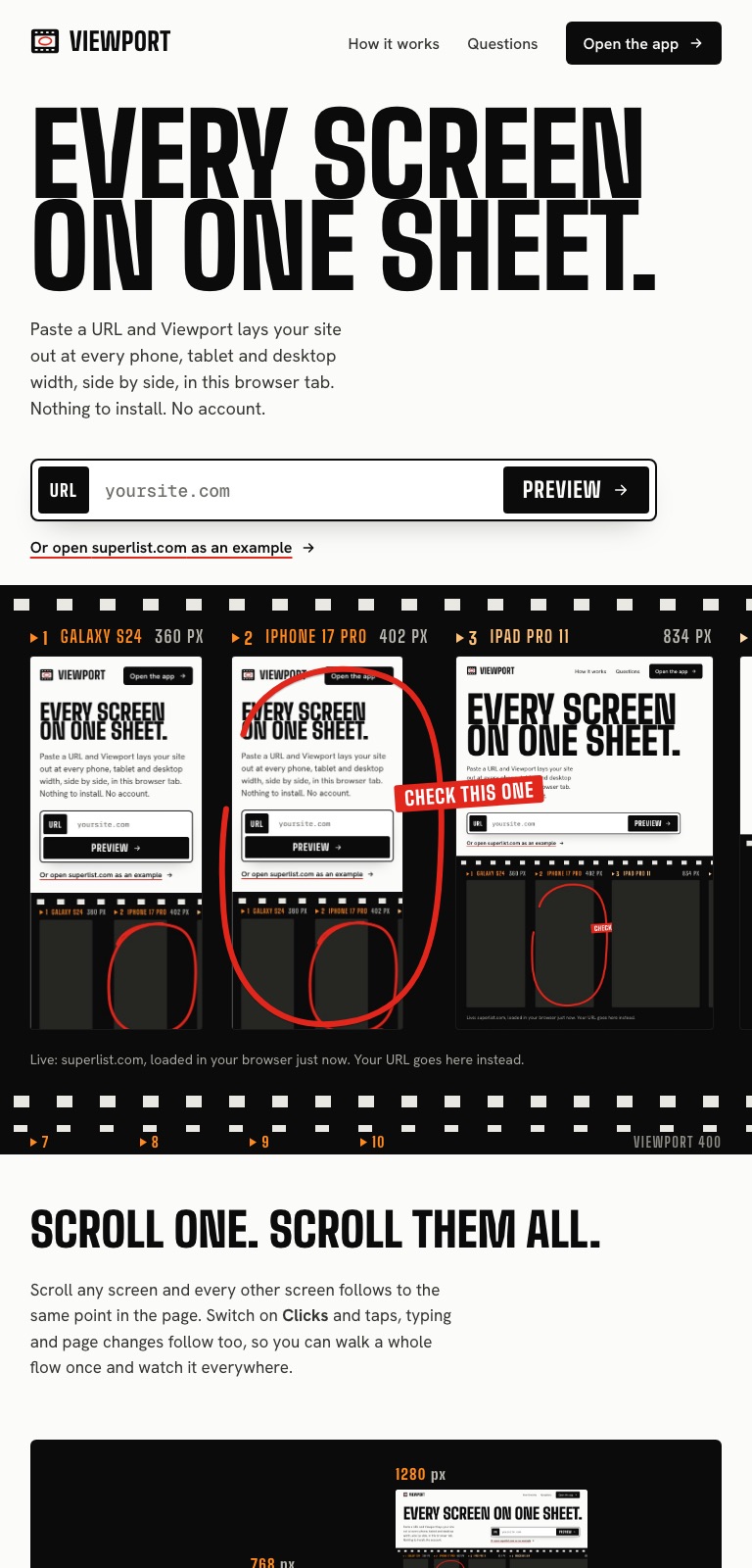
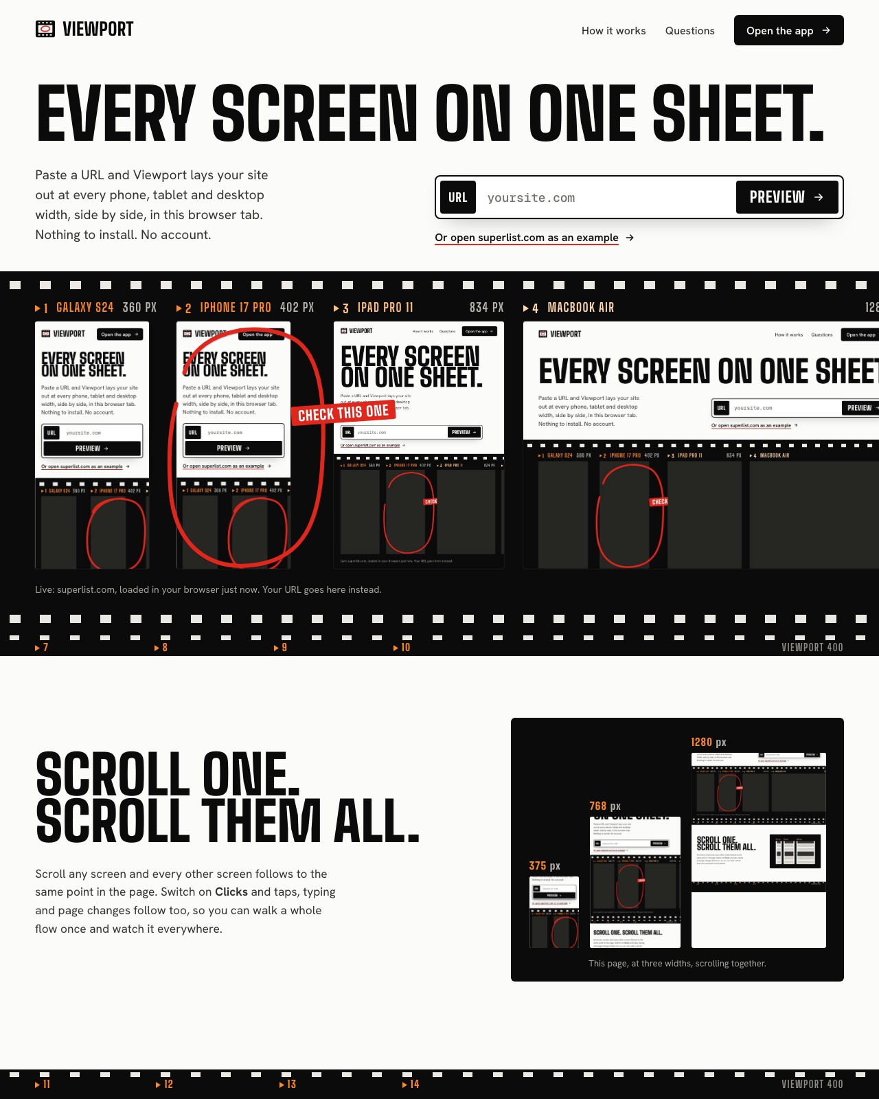
Paste a URL and Viewport lays your site out at every phone, tablet and desktop width, side by side, in this browser tab. Nothing to install. No account.
Live: superlist.com, loaded in your browser just now. Your URL goes here instead.
Scroll any screen and every other screen follows to the same point in the page. Switch on Clicks and taps, typing and page changes follow too, so you can walk a whole flow once and watch it everywhere.
Open Simulate and every screen switches at once: dark mode, four kinds of colour blindness, blurred vision, 200% text and reduced motion. Hide cookie banners while you review, without accepting anything.
Colour blindness and blur work on any site. Dark mode, text size, motion and banners need your site to include the bridge.
Copy a link that opens the same URL on the same screens for whoever you send it to. Export the sheet, or one device, as a sharp PNG and circle what matters before you send it. Record a short video while you click through. Or go full screen and step through each device in a review.
See every breakpoint without leaving the code.
Keep Viewport open on localhost while you build. Scroll one screen and watch 375, 768 and 1280 move together, then fix what breaks while it’s still on screen.
Show the build the way the client will see it.
Put the site in real hardware frames, circle what changed, and send one link or a PNG. Presentation mode walks a room through every device.
Cover the device list in one pass.
Keep a set for the phones your analytics care about, walk each flow once on every width, and attach marked-up captures to the ticket.
70 phones, 25 tablets and foldables, 10 laptops and 8 desktops and displays from 7 makers, 162 to 2560 px wide. Any other size is one form away.
DevTools device mode is a debugger for one screen. Viewport is for seeing and showing every screen together. Use both; here is the honest split.
Production, staging or localhost. Anything your browser can open and the site lets be embedded.
Start from the default phones, pick a set, or type the exact widths your design uses.
Scroll and click through every screen at once, then share a link, export a PNG or present.
Many sites send X-Frame-Options or a frame-ancestors policy that tells browsers not to show them inside another page. Viewport respects that. It works best with sites you run: production, staging or localhost, where you control those headers.
Yes. Viewport is a static web app with no account and no server of its own.
Yes. Your browser loads each screen directly, so http://localhost:3000 works as it does in a normal tab. Nothing is proxied.
No. Each screen is a real browser viewport at the device’s exact CSS size, which is what your layout and media queries respond to. It does not change the user agent, pixel ratio or browser engine, so test on hardware before you ship.
Pages served from Viewport’s own address connect automatically. For any other site you run, add one line before </body>: <script src="https://YOUR-VIEWPORT/viewport-bridge.js" defer></script>. It only talks to the Viewport window showing the page. It is also on npm as viewport-bridge, with a Vite plugin and a React component.
No. It is the fastest way to see and fix layout at every width while you work, but touch, fonts and the phone’s own browser still deserve one pass on real hardware before release.
Any current browser can open and use the workspace. Capturing images and video needs a desktop browser that can share a tab: Chrome, Edge, Arc or Firefox.
Yes. The catalogue is updated as new phones, tablets and laptops ship, and you can add any size yourself in a few seconds.
Nowhere. Devices, sets and recent URLs stay in your browser’s local storage, and the pages you preview load straight from their own servers.
Nothing to install. No account. Works with localhost.